Thursday, May 5, 2011
Final Post :(
I decided to use a stop motion video as my final project. Even though this video is short, it took me forever to do. First of all, it took a couple of hours just to make the "stage" I used three pieces of wood that were painted white and then I had my friend use an air gun to put them together. Then, I had to set up lighting (I chose to use flat light--more on that later) and set up the camera angle I wanted. After this I started out just waiting for the apple to rot but because that was taking too long and I only had a certain amount of time to spend with the materials I borrowed I had to hurry the art process so I took an apple I had rotted earlier and replaced it with the original apple in the beginning. All in all, stop motion takes a very long time; I have an even better appreciation for it now than I did before.
My video is based around the fact that time cannot heal pain, despite the saying. When something terrible happens (such as a death or a break-up) that emotional pain cuts through you--it cuts through your soul or your core (hence, there are clear cut holes through the apple core). When this happens the first thing to leave your soul is the happiness, love, and optimism you once possessed (represented by the white strips of paper, which are hopefully readable). These are the types of emotions that leave quickly. Then there is this period where you aren't really sure how you feel, possibly feeling "nothing at all". This is represented with a space between the white and black words. When the black words (misery, torture, desolation, etc) come out of the apple's holes, they are noticeably moving at a slower speed. This is purposeful because when these "bad" emotions emerge they come out of us slowly, dragging the pain on and on. At the re-emergence of the "good" feelings, the "bad" feelings surround the "good", squashing them completely out of sight for you. As time goes on (represented by the moving apple), "bad" feelings seem to linger in the voids of your soul, causing you to essentially rot from the inside, out. The rotten apple at the end has the word desolation on it because it represents a person literally destroyed by the "bad" feelings that took over their soul.
Everything in this clip is of utmost importance; everything was done for a specific reason. First of all, the stage my stop motion was set on was white specifically because I wanted an institutional feel to my video. However, the white boards were not enough so I decided to use the bleach filter on my video in order to help get the creepy effect I was looking for. (Unfortunately I think it may have made the words harder to read.) The reason why I chose to use black and white papers for my words was because I was employing the archetypal black and white as bad and good. I placed the apple in the corner because even though there is no where to hide from pain, it is still making that attempt. There are two reasons why I chose a green apple instead of a red apple to represent the human heart (emotional center): one, I looked up the meaning of apple colors and green represented love and two, green apples brown faster (because they are used for baking) so this made the green apple a better choice over the red apple. In general, I liked the look of a green apple against the white instead of a red apple. Another thing that I wanted to represent symbolically was the small ball of hope inside of Pandora's Box (when I had all the white words bunch into a circle). I wanted to show that darkness would swallow that ball of hope, leaving nothing. Right before that I have the words love and hurt circling each other, almost like the prelude to a showdown that love is going to lose. I also have the words "crawling" out of the apple holes so that they look like bugs (worms or ants, I can't decide which). This adds to the sense of destruction. On another note, the amount of words used is equal because happiness and sadness are equally strong emotions, just experienced in different ways. Finally my musical selection (Kesson Deslaf by Aphex Twin) is based on the fact that it is simple and very sad. It helps evoke the feeling that something is missing and that whatever it is happens to be irretrievable. Besides the minor mistakes (that I could not fix due to the fact that I had a limited amount of time to spend with the equipment I needed) and the fact that I wish I had shown a whole apple and then each slice from it before the video started, I was mostly happy with this stop motion; I thought it turned out quite nice.
Monday, April 25, 2011
Looking Away and Seeing Too Much by James Elkins
This excerpt really grabbed my attention because it was all about drawing from memory. I often do this because I am too lazy to usually grab a picture of what I would like to draw so I attempt it from memory. Things that I am more familiar with seem to be easier to draw from memory rather than things I don't see on a day to day basis. For example, I can draw eyes from memory better than I can a flower. There are so many parts of flowers that I have never looked at in depth that I could never draw from memory.
It is so interesting to see that when you draw from memory you tend to add things that aren't there. This is probably because of the composite images you have built up in your mind of a certain object. For example, we all have the image of an apple in our minds but each of us pictures a slightly different apple. The apple that we are picturing is not the same as every object we call an apple because it is a category for things that look like apples. It is so interesting that every person has a different image in their mind though.
Another part of this writing that fascinated me was the part about war photography. It is quite unsettling to see people alive in one frame and dead in another, as Elkins points out. However, at the point between the frames, that moment between life and death, time has occurred and in these pictures a death has been trapped. After reading about this I really didn't know how to feel but I definitely understood the unsettling nature of the photographs. The pictures bring the imminent sense of danger to the viewer. When I had visited the Walter Reed Medical Health Museum in D.C. (which is next to the military hospital) last summer I saw many a picture like this; the museum itself creeped me out--in a good way, I guess.
In an interesting jump, Elkins moved on to talking about how artists sometimes focus on things that really shouldn't matter as much such as the sexuality of Christ rather than his--or her--identity and presence. I had never really thought of this before but I really feel like he had a good point. When he then mentioned live modeling and that you find yourself looking at a hand rather than other unmentionables, your sight is being deflected. In the same breath he also mentions that your eyes are also drawn to certain things. I have experienced this when looking at works of art. I am so consumed by one object in the picture it takes me a little while to deflect my line of vision and explore the rest of the work of art.
All in all, I really enjoyed this reading. A few questions I have are: 1) If you were to take a series of pictures at the moment someone is born, would the entrapment of their birth between the frames seem unsettling such as a series of pictures of death? and 2) As an artist can your line of sight get blinded by your own artwork? Is it possible that while making a piece of art you get totally consumed in one aspect of it and ignore the details of others? If so, what would this mean or do to the artwork?
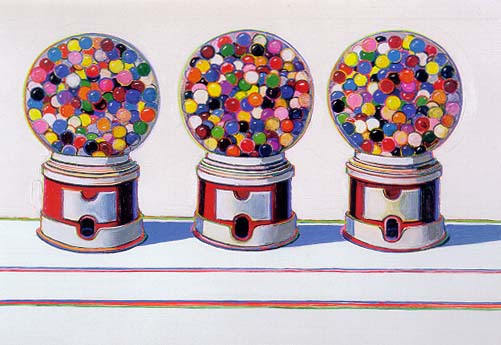
Last note, the beginning the reading reminded me of Caroline's artist she presented, Wayne Thiebaud.
It is so interesting to see that when you draw from memory you tend to add things that aren't there. This is probably because of the composite images you have built up in your mind of a certain object. For example, we all have the image of an apple in our minds but each of us pictures a slightly different apple. The apple that we are picturing is not the same as every object we call an apple because it is a category for things that look like apples. It is so interesting that every person has a different image in their mind though.
Another part of this writing that fascinated me was the part about war photography. It is quite unsettling to see people alive in one frame and dead in another, as Elkins points out. However, at the point between the frames, that moment between life and death, time has occurred and in these pictures a death has been trapped. After reading about this I really didn't know how to feel but I definitely understood the unsettling nature of the photographs. The pictures bring the imminent sense of danger to the viewer. When I had visited the Walter Reed Medical Health Museum in D.C. (which is next to the military hospital) last summer I saw many a picture like this; the museum itself creeped me out--in a good way, I guess.
In an interesting jump, Elkins moved on to talking about how artists sometimes focus on things that really shouldn't matter as much such as the sexuality of Christ rather than his--or her--identity and presence. I had never really thought of this before but I really feel like he had a good point. When he then mentioned live modeling and that you find yourself looking at a hand rather than other unmentionables, your sight is being deflected. In the same breath he also mentions that your eyes are also drawn to certain things. I have experienced this when looking at works of art. I am so consumed by one object in the picture it takes me a little while to deflect my line of vision and explore the rest of the work of art.
All in all, I really enjoyed this reading. A few questions I have are: 1) If you were to take a series of pictures at the moment someone is born, would the entrapment of their birth between the frames seem unsettling such as a series of pictures of death? and 2) As an artist can your line of sight get blinded by your own artwork? Is it possible that while making a piece of art you get totally consumed in one aspect of it and ignore the details of others? If so, what would this mean or do to the artwork?
Last note, the beginning the reading reminded me of Caroline's artist she presented, Wayne Thiebaud.
Tuesday, April 19, 2011
Critique!
My most recent art project I would consider a success. When the class was doing a critique of my abstraction of order vs. change I was thrilled to hear that they thought that my project was about exactly what I meant it to be. In my opinion, as an artist that it is a very satisfying feeling to know that your artwork is easily understood.
However, looking at it objectively, there are many problems with my canvas. On the left side that represented order, I feel that the lines were not perfect enough. They contained many flaws that they should have not. I should have measured each line so that it would be the same width as all the others and that the white space between the black lines was also of the same measurement. Another huge mistake I made on the left side was the small imperfections of the black lines (due to the paint used on the tape) that could have been rid of but were not. The reason why I have such a problem with these imperfections is that it took away from the dramatic meaning of the left side of my canvas. I felt that those flaws showed some sympathy towards order; since it is impossible to be perfect. That was not, however, my intention. The stark black and white lines were meant to create a feeling of detachment. Even though this was probably still conveyed in some way, I felt like the imperfections of my lines were way too sympathetic to the cause of order.
Another thing I noticed was that my paint was not nearly as thick as it should have been on the chaos end of my canvas. The thickness would have added way more texture, drawing the viewer's attention in more, as well as make it harder for the white lines to fit so smoothly over the painting. That would have added to the feeling of uncontrollable chaos.
I really feel that my artwork would have been interpreted differently if it were put on a differently colored wall. It was nice to hear my classmates bring this up because I had considered this prior to presenting my work. I think it would be interesting to see my canvas placed on a black background because then you could see the white lines more prominently extended off of my canvas. However, I think that would take away from the illusion that order just disappears inside the cracks of the wall once chaos takes over.
So after considering the critiques of my artwork, I think it would be interesting to change the orientation of it, perhaps into a cyclical piece or into a sculpture as a sphere. If I changed the orientation I could perhaps further explore chaos and breaking the confines of the shape. These are all interesting considerations and I wish I had more time to explore and create all possible options.
Tuesday, March 29, 2011
The Importance of Auditory and Visual Cues In Film
While watching the iMovie projects in class yesterday, I noticed that the audience's feelings toward them were highly influenced by the filters used in the video. At times it was easier to understand the mood or situation in the video due to the filter used. The colors appeal to our senses so it makes sense that the use of color (or lack thereof) helped to create a certain mood. For example, many students chose to use the dream or romance filter to depict a difference in sense of time and/or reality. Another filtered used was the black and white. This lack of color helped to add an element of seriousness to the video and a touch of sadness or emptiness. Overall, from watching the videos yesterday, I learned that filters are a huge visual clue to the audience because it reveals the situation as well as mood of the video.
Another interesting thing I noticed is that music is a very useful auditory cue to the audience. The music is what really helps to set the mood and it even sets up the tone of the video. Sometimes people used just one song, other times they used multiple. Using multiple songs allows for the viewer to pick up on mood or tone changes; using one song lets the viewer know that there is one over-arching theme in the video. For example, Kelsey and I both used one song for our videos which helped the audience to understand that while her video was total happiness, mine was total sadness. In Kat's video, she had an entire playlist because her storyline went in multiple directions, varying from happy to sad. Auditory cues really help the audience keep track of the storyline and the sounds definitely tell the audience how they should be feeling.
However, Caitlin didn't really use many auditory cues in her video but she still got her point across. I think this is because she still gave visual cues through dialogue. Trying to tell a story without auditory or visual cues would be pretty hard to do. Mike's video lacked dialogue but included music. I think that without the music it would've been pretty hard to understand his video. However, the dinosaur was engaging in activities that we have all experienced so the visual cues were pretty clear. So, in my opinion, every film has to contain at least visual cues for the audience to understand what is going on; music mostly helps to "set the stage" by providing a mood/tone.
Wednesday, March 23, 2011
Around the World in 2000 Pictures
This is an interesting video I found by Alex Profit. His video takes the viewer on a tour through Paris, Barcelona, Berlin, St. Petersburg, Shanghai, Tokyo, New York, and London.
Tuesday, March 1, 2011
Looking Back
The first half of the semester felt like a lot more reading and learning concepts such as time in relation to space and space in relation to time. It seems as if our class also spent a lot of time learning how to understand a piece of art and to properly critique it. The first two questions the class tackled were “What is art?” and “What is time?”. These are two very important questions to ask an intro art class and the best part about them is that they are open-ended due to their philosophical nature. The vast array of questions gets the class thinking, exploring different possibilities, almost training the brain to think more like an artist. Most of the Intro to Visual Thinking course is about understanding what constitutes art and how to go about understanding and critiquing it.
In the first class of the semester we watched and discussed Kylie Minogue’s video by Michel Gondry for her song “Come Into My Wolrd”. I really liked how he took the cyclical nature of the chorus in the song and visually represented it in such a creative way. There was so much going on in that video yet the sense of time was not changing, just the events between each start point. In the second class we watched Cibo Mato’s “Sugar Water” which was another music video by Michel Gondry. I think that his artistic representation of time is awesome and original. I personally like how he manipulates time to tell a story a certain way. This brings me to “Momento” which is a movie that we watched in class. This too had a unique timeline, making for a different and interesting story. From the videos and the movie I have learned how to force my brain to view the concept of time in a different way and they have also taught me that time doesn’t need to be represented chronologically or linearly, that’s just the way the mind thinks. I actually find it to be stimulating to think of time in a non-conventional way.
If I have learned anything from this class, it is how to represent sensory concepts such as time, motion, and sound in my artwork and the type of affect that can create. Taking a look at Futurist paintings had really impressed upon me that it is possible to simulate motion even in paintings and drawings. Comic books do the exact same thing. I never knew the power of simple lines until I attended this class. Something I truly enjoyed doing was practicing synesthesia. Not only was it fun but I also felt more emotionally attached to my art by trying to recreate sound rather than motion and time. This is probably due to the fact that in society today, we are used to constant, rapid movement—it doesn’t fascinate us as it did with the Futurists—instead we feel more of a connection and fascination with music and sound. Perhaps that is because of the popularization of the iPod. People are no longer looking up as they commute to and from wherever, but instead they are looking down, generally donning a pair of ubiquitous white headphones.
So, to wrap this up, I think that the most valuable aspects of the class so far are: learning that art and time have no true definitions, it is possible for motion, time, space, and sound to be visually represented, and that critique is necessary in art in order to improve upon your skills. Therefore, presentation and discussion of artwork in class is an extremely important concept to force onto the class because it's the part about being an artist that is more of a challenge than one would think.
On a completely different topic: our next project for class involves researching an artist for a research paper and presentation. I have found three amazing artists that interest me a lot.
Jackson Pollock: Inspired by Indian sand-painting, Mexican muralists, and Surrealist automatism, this abstract expressionist used action painting (coined later than his time) to create very unique works of art. I like that every gesture on his canvas is a "liberation from value" (Harold Rosenburg). I wonder if his excessive drinking is the reason that his paintings are so charged with energy. This is a piece of his that I really enjoyed:

Piet Mondrian: One of the forerunners of the De Stijl (Neo-Plasticism) movement, Piet managed to express the concept of harmony and order in abstract ways. However, aside from his most popular work (pictured below) I also like some of his early work where he is inspired by cubism but is still using representation in his artwork. As an additional note, I'm confused as to why he uses colors like red and yellow which signify anxiety to me when this piece is supposed to be representing harmony.

Alexey Brodovitch: A designer, photographer, and teacher of rebelling against convention and embracing the unknown. He produced many successful artists. His popularity came from the magazine Harper's Bazaar. The works that I'm most interested by him though are his ballet pictures that he published. He went against the documentary-style pictures of his time and kind of did his own thing. I admire that. I wonder if Brodovitch ever felt that his work was cheapened because of it being so commercial. I think that I would definitely feel this way. Maybe he enjoyed the mass exposure his artwork got. This is one of his pictures from "Ballet":

Hopefully choosing an artist for my research project won't prove to be too difficult!
Monday, February 28, 2011
Public Art: Community and Politics
On Monday, February 21, 2011 at 4:40 pm, I attended at collaborative art lecture about how public art plays a huge role in community and politics. The four panelists that spoke were Diana Boros from the Political Science Department, Lisa Scheer and Billy Friebele from the Art and Art History Department, and Katie Ganz from the Languages and Cultures Department.
Diana Boros discussed how politics is prevalent in public art. She defined politics in this setting as a multitude of unwritten rules and interactions that affect the way people interact with the world around them. Politics affects the public because it beautifies spaces, creating pride within the community, it is a direct political critique, inspiring protest, and it is a demonstration of new ideas a viewpoints, introducing new concepts to others to share.
Lisa Scheer then discussed what makes public art public, sharing with us her various sculptures that she had been commissioned to make for the public. To her, public art usually incorporates the environment and identity of the location as well as the people living in it, making this piece special to the locals who come to feel as if the artwork is also theirs. Lisa personally adds abstraction to her work. In her opinion, abstraction is evocative and has many meanings due to latent imagery (i.e. her sculpture outside of the New York courthouse that resembles a flaming torch but also has helping hands which were inspired by the aftermath of 9/11). When viewing public art, Lisa states that the viewers are not the audience, but instead participants.
Billy Friebele went on to discuss his experiences as an artist, getting his audience to become participants, as Lisa had discussed. He had his viewers explore the site itself as an artwork. In doing this, the entire landscape becomes public art. Another project he did was site-specific mapping in Washington D.C. which was projected onto a library wall. This is a new age for public art because up until now, that wasn’t something that could be done. Another interesting thing to note is that public art doesn’t have to just be outside anymore, it is virtual as well. It truly is a new age for public art.
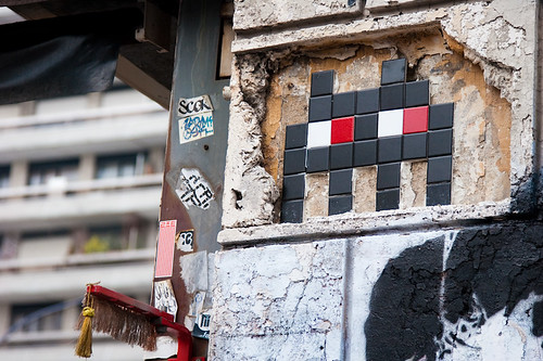
Katie Ganz brought a new perspective on public art by describing public art in Paris, France in the past and in the present. She spoke about how Napoleon III hired Baron Georges-Eugene Haussmann to put an end to Paris’s identity crisis and create a new sense of pride and community between citizens and government officials alike. The Baron created new and efficient roadways with monuments at each end, creating a sense of symmetry the city had lacked beforehand. He also made it so that treelines were even with the sight of a building, again adding that layer of symmetry. Because he increased the aesthetic beauty of Paris, he relinquished some of the unrest that the city was experiencing at the time period. Fast forward to now: direct political critique is rampant in Paris. There artists have placed all kinds of statements on these 19th Century monuments. One of the more popular ones that people really enjoy interacting with is the invader art (pictured below). However, there are more radically political statements seen around the city such as "Je ne veux plus [I don't want any more of...]" which are little pieces of paper in which people write what they don't want any more of in the city. Also, artists in this day and age do not put their art up in the air but closer to the ground because this is where the modern day viewer is looking. In these ways, Paris's art is extremely participatory.
After this lecture, I found myself wondering if my art that I consider to be public is interactive. I made a postcard for class which in its own way is public art because it isn't meant to be hung on a wall or plopped in the middle of a room. My postcard is meant to be something plain on the outside, but as you open it up (in an unconventional manner) you are forced to view each part of the picture separately. Also, the motion of opening this card is meant to emulate wind because my card is about how windy it is at St. Mary's. Although the visual aspect of my card didn't come out as nicely as I would have liked it to, the concept still made sense and it still forces the viewer to participate in my work of art. Going to this art lecture has given me some more ideas about how to present my artwork next time and it has given me a much better perspective on public art.
Tuesday, February 15, 2011
Artist Talk With Ryan Browning
Artist Ryan Browning visited our campus last Wednesday, February 9, 2011. He presented his artwork from 2006 to 2010 and some of his plans for 2011. I found it interesting that Dungeons and Dragons as well as the emergence of 3-D graphics in video games had influenced a lot of his artwork.
In 2006 the first piece of art that he had been truly proud of was a map that he had cut up and pasted back together. He said he really liked the idea of crossing boundaries or eliminating them completely. This got him thinking about spaces in proportion to where they belong.
In 2007 a game called EverQuest came out that changed Ryan’s perception of space. He said he liked the idea of spending time with others in an artificial world. He also enjoyed the polygonal imagery and the fact that you could make yourself whatever you wanted. However, he has chosen to use his digital influence in a traditional medium.
In 2008 Ryan created a polar bear sculpture to explore the interaction between virtual imagery and real space. At this time he was also exploring the creation of the persistent world. This is apparent in his painting, “Birth of an Island” which is like a Genesis story. This is also where Ryan begins using polygonal shapes to represent his main focus in his artwork.
In 2009 he begins to seriously consider character, using his polygonal figures as human surrogates. The reason why he chooses to use surrogates in place of humans is because he feels that people in pictures are limited. The main goal here is to get his audience to interact more with his artwork.
As Ryan moved into 2010 he decided to take his artwork a step further and loosened up his geometric images, flattening out space, and the incorporation of motion. A very interesting piece he did called “Time Machine”, which also happens to be his favorite, includes many non-geometric images in it but they are more of the background to offset the loosely geometrical time machine that has been defaced with graffiti due to the fact that time travel never happened in the future.
For the coming year Ryan has some interesting new inspirations. He is now working on incorporating a moody, romantic darkness coupled with gothic cathedral architecture to his artwork. I cannot wait to see what he decides to do next; his work is like nothing I’ve ever seen before.
After the Futurists PowerPoint in class yesterday I noticed some similarities in that they use a lot of geometrical shapes to represent other things just as Ryan does. I think that this type of abstraction is appealing because it is like looking at the world with different eyes, perhaps even kaleidoscope eyes. It forces the viewer to look at the world in a way they never had before, allowing them to absorb the beauty of the artist’s depiction of the world through his or her eyes.
Ryan Browning’s artwork relates to mine in that we both have been influence by similar things. I have been influenced by video games (as well as the bright colors that I see in them). I too enjoy the old crappy graphics of the original 3-D games. What I truly take away from his artwork and artistic experience is that I can include character in seemingly inanimate objects.
Sunday, February 13, 2011
I Think It May Be Nine In the Afternoon
It’s been a while since our last class but that doesn’t mean I have been up to nothing at all. Our first assignment was to practice drawing the negative space. I found this exercise very enjoyable because for once I felt like I could draw! It’s amazing how your perspective changes from drawing the space around the object instead of the object itself. This method works for me because it forces me to stop paying attention to all the small details. The small details are most certainly important but it’s impossible to consider the smaller details when you don’t even have the broader subject drawn yet. I’m sincerely glad that I was taught how to do this; it feels as if my artistic skills have dramatically increased.
The second assignment was a reading from John Berger about the importance of visual arts. The very first thing you read is: “Seeing comes before words. The child looks and recognizes before it speaks.” I’d never really thought about the fact that we first see before we learn to speak. Yet, the words we learn to use to communicate and to describe our emotions cannot even begin to describe the true extent of them. Love, the obvious example, happens to be one of the hardest emotions to capture with words. That is because love is such a physical and deep emotion. It certainly cannot be described by words alone. The same goes for heartbreak, depression, and despair. These emotions have plagued many artists throughout history, all of them trying to capture this emotion, their art speaking to many viewers. The saying “a picture is worth a thousand words” comes to mind, now that I think of it. Visuals truly do speak volumes more than texts have the ability to.
The reading also brought up a good point about cameras. They destroy a painting’s initial meaning because they take away from the fact that it is unique. Even if a painting was meant to be transportable, it still was the one and only copy. It never occurred to me that the invention of the camera could be a bad thing. I have always viewed the camera as one of our greatest inventions. I still believe it is, but now I can see why taking a picture of another piece of art takes its true meaning away from it. Since I was a young child I can remember seeing pictures of the Mona Lisa in textbooks, on televisions shows, and such, which has made me realize that I have no proper appreciation of the painting, which in my opinion is just wrong. However, I am still split in that I probably would have never seen this picture in my life unless we had cameras that have allowed me to see this painting. This reading really got me thinking; I liked it.
I really wonder if our perceptions of major artworks would be different if we never had preconceived notions about them thanks to the availability of them due to the invention of the camera? Also, do you think it is possible to only communicate with visuals or are words necessary for higher level communication?
I really wonder if our perceptions of major artworks would be different if we never had preconceived notions about them thanks to the availability of them due to the invention of the camera? Also, do you think it is possible to only communicate with visuals or are words necessary for higher level communication?
Our third assignment was to draw a nude model. I have to say this has by far been the most interesting experience of my life. I kind of felt like I had no idea what I was doing but I found that I really enjoy drawing torsos, legs, and arms. Also, I was very thankful that I had learned how to draw negative space because this really helped me to be able to draw the model’s figure. I will admit that prior to attending the drawing session I was incredibly nervous that I would completely suck at drawing. However, after the session I was quite proud of myself! :)
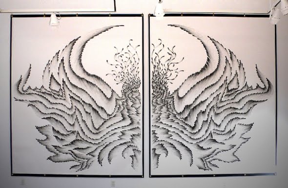
For the final segment of this post I would like to share with you some drawings I stumbled upon that I thought were fantastic! They are all called "Fingerings" by Judith Braun. I can't even explain why I love them, they just appeal to me. Perhaps it is because I have never seen anything like it. She dips her fingers in either charcoal or pastel and then draws in either abstract forms or bilateral symmetry. Here are some of my favorites of hers:


(Images taken from Google Images)
Wednesday, February 2, 2011
Stay
Watching Momento in all its confusing glory made me think about one of my favorite movies called Stay starring Ryan Gosling and Ewan McGregor. It's an awesome movie. Though the perception of time is not as predominant as the perception of reality and the psyche, the movie still pertained to the subject matter so I thought it would be worth posting about it here.
In short, the movie is about a psychiatrist (Ewan McGregor) that is trying to prevent one of his patients (Ryan Gosling) from committing suicide while trying to maintain his grip on reality. If you want to know more about Stay you can read this. Don't read too far into the summary though because there will be major spoilers.
I highly suggest you watch this movie if you enjoyed Momento. There is a lot more symbolism in Stay, making the movie slightly harder to understand, but after watching it a couple of times you will really appreciate the genius of this movie.
 |
Tuesday, February 1, 2011
Time Is Running Out
Last class we discussed J.G. Whitrow’s What is Time: Time and Ourselves. I enjoyed Kant’s idea that we all possess innate faculties such as the perception of time. Humans are able to conceptualize that life does come to an end, time is essentially running out. By looking at artwork through the ages, one can see that many artworks deal with the ensuing threat of death and the memories that artists would like to preserve. Our death and our birth, they are the markers that we existed here on earth. The time spent in between—the memories made—they are up to us. By using art, memories can be preserved in time, keeping them from being altered in our minds, perhaps even conveying truths or greater truths. I believe that everything that happens in our life is recorded into our brains but only the outstanding memories are the easiest to access.
In the reading I learned that “time is not a simple sensation but depends on processes of mental organization uniting thought and action.” This is our reaction to change. The changes in life are often documented and preserved through art of all forms. Be it song, painting, or sculpture, life is instilled into these mediums by the artist. By creating his or her own works of art, an artist is able to impart a part of his or herself unto their medium, effectively ensuring their immortality through a permanent and beautiful piece of art. This immortality gained through remembrance, although not a true immortality, gives the artist a sense of pride and value in his or her work.
Upon reading this article, I began to question whether or not I believed in Déjà vu. I feel that our brain connects certain similar situations to present events, leading us to falsely believe that we’ve seen that very situation occur before. I find it slightly ridiculous and hard to accept as true. If it is true, is it a product of human evolution?
Also, I liked the verse by Guy Pentreath:
“For when I was a babe and wept and slept, time crept, and when I was a boy and laughed and talked, time walked, and as the years saw me a man, time ran, and as I older grew, time flew".
I wonder why as we get older, our sense of time changes? Is it because we come to the realization that “time is running out”?
So, since I've been talking a lot about how time is running out, I decided that I wanted to know more about the song "Time is Running Out" by Muse.
These are the lyrics:
I think I'm drowning
Asphyxiated
I wanna break this spell
you've created
You're something beautiful
A contradiction
I wanna play the game
I want the friction
You will be the death of me
Yeah you will be the death of me
Bury it
I won't let you bury it
I won't let you smother it
I won't let you murder it
Our time is running out
Our time is running out
You can't push it underground
You can't stop it screaming out
I wanted freedom
Bound and restricted
I tried to give you up
But I'm addicted
Now that you know I'm trapped
sense of elation
You'd never dream of
Breaking this fixation
You will squeeze the life out of me
Bury it
I won't let you bury it
I won't let you smother it
I won't let you murder it
Our time is running out
Our time is running out
You can't push it underground
You can't stop it screaming out
How did it come to this?
Ooooohh
Yeah you will suck the life out of me
Bury it
I won't let you bury it
I won't let you smother it
I won't let you murder it
Our time is running out
Our time is running out
You can't push it underground
You can't stop it screaming out
How did it come to this?
Ooooohh
First off, upon listening to the song you will notice that there are a series of clapping/clicking noises meant to represent a ticking clock. When you watch the video you will notice that the band is playing on a conference table and that all the political heads in attendance do the exact same things (implying conformity and unwillingness to change). The significance of the band being in attendance, playing this song, is that they are trying to give a wake-up call but they are completely ignored (implying the underdogs of society need to be listened to). Then you see the political heads kind of strip dancing. I think this is to show the corruptness of the "people in charge". The end of the video emphasizes the lyric, "How did it come to this?" because it shows the political heads throwing their papers in the air in a deranged manner, and then leaving the scene. This symbolizes their inability to deal with the world's problems and so they therefore ignore them despite the fact that our "time is running out". I wish I had more insight into this video and song but it was very difficult to find information on. Hopefully, though, this helped to raise some questions.
Wednesday, January 26, 2011
I Was Looking Into The Mirror
Last class, Monday January 24, 2011, we began by watching Cibo Matto’s video for “Sugar Water” by Michel Gondry. The video showed two women, one in which time was moving forward and one in which time was going in reverse. Once they both reached the site of the accident, their perception of time switched. We worked in groups analyze what was going on in the video and the time in which it was taking place. It was fascinating to see the different types of charts that people came up with to represent the time flow in the video; some made cyclical charts using pictures to describe the video, others simply used a vertical timeline (very similar to the timeline that Michel Gondry created) to show that the pivotal point of the video is the accident and that is where the time changes, never revealing beyond that point. I really enjoyed this video because it had depth and meaning beyond the artist’s lyrical meaning. I like that you cannot take this video at face value and that even after we discussed it as a class we could not really come up with a definitive meaning for it. This work (as well as many other works of art) is subject to the viewer’s opinions and ideas. This statement leads us to the question we attempted to answer during class: What is art? The class determined that art includes feeling, shape, thought, color, taking context into consideration, story telling, documentation, reflection, spiritual, and entertainment. Now it doesn’t have to include all of these but it does include at least one of these things. It was also decided that the viewer is the one who determines what is art. I feel that the viewer does not always determine what art is though. In my opinion, I think that the artist determines what is art. Just because no one else at the time doesn’t understand, that doesn’t mean that what the artist has made isn’t art. Art can be used as self-fulfillment; it doesn’t always have to mean something to every viewer.
I found JG Whitrow’s What is Time? to be extremely fascinating. I had never in my life thought about how time is an idea and not necessarily a thing until I read this article. It makes perfect sense that we can understand time until we have to verbally explain to someone else what it means. My favorite part of this article was about the Mayans and the Mayan calendar. I think it is interesting that everyone, including the Mayans, believe that the calendar will soon run out, the cycle will end, leading in disaster. I do not believe this. Time is infinite and since it is not truly tangible it is essentially something that is uncontrollable, but probably eternal. Time is more than a calendar and dates, months, weeks, days, hours, minutes, and seconds. Essentially, time marks change. Therefore, I agree with Whitrow when he says, “our conception of time is the dominant feature of our world-view. Perhaps if we did not acknowledge time and the organization it brings to our lives, there would be more chaos in the world as we know it.
I wonder if time can truly be portrayed by art. Time is constantly changing; it is in flux. Therefore, can one moment in time captured by the artist be the true image of that time before it has passed? Our memories and perceptions are never constant and even a photograph cannot perfectly depict the exact image we saw with our very own eyes. On another note, is something only considered art if other people besides the artist see it? I personally feel that the artist decides why their work is a work of art but I can see how the viewer will have their own personal experience with the art as well. Just some questions to get you thinking!
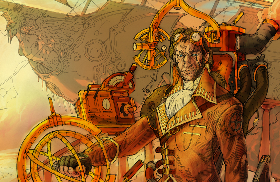
Just recently I discovered Steampunk art. It is probably one of the most interesting things I have stumbled upon yet! What exactly is Steampunk, you ask. Well, it is a sub-genre of science fiction, alternate history, and speculative fiction. It is a world in which steam power is still used, such as Victorian-era Britain. It mimics the styles of authors such as Jules Verne and H.G. Wells. The growing popularity of Steampunk among gamers, geeks, goths, cybergoths, industrial music fans, and punks has caused it to become a bit of a cult movement; essentially it has developed its own culture and lifestyle. Steampunk really fascinates me because I like that people are taking interest in the old and the aesthetic appeal of it. I also really enjoy science fiction so it is fun to see some of the stuff I’ve read about only in books. Whether you know it or not, you have seen Steampunk influence. Have you ever watched Disney’s Treasure Island? Do you have a large fascination with clocks? Have you ever gotten the urge to wear a corset and carry a strange gun? Perhaps you have and perhaps you haven’t but nevertheless you will now be blessed with the opportunity of learning about what Steampunk art really is. Here are some examples of it:


(All information about Steampunk came from Wikipedia, pictures came from Google Images.)
Subscribe to:
Posts (Atom)